Final hi-fidelity prototypes
left: homepage right: online shop

01. OVERVIEW
This case study showcases 3 months work I have done with a team as the UX/UI designer. It details how I juggled multiple tasks from discovery to final high fidelity prototypes.
02. THE CHALLENGE
Ease of use
The problem statement
Social media savvy Australian women aged between25 to 35, often feel overwhelmed when browsing the frankie website. They want to be able to find the content and products they desire with ease, but do not know how to navigate the content heavy website.
Project Goals
-
Discover the pain points the website has and come up with a desktop prototype to solve these issues.
-
Communicate more and encourage users to purchase the bi-monthly magazine subscription.
-
Create an easier pathway through the website to purchase an item or subscription.
02. THE BEGINNING
The Approach
Our team initiated the project with qualitative research, conducting interviews with target audiences through open-ended questions to identify their pain points. My specific responsibility involved performing a heuristic evaluation of Frankie's current website to identify usability flaws. From the gathered insights, we synthesized a customer journey map to visually represent the user experience while interacting with the website.

User interview synthesis

Customer Journey Map
02. FINDINGS
What we discovered
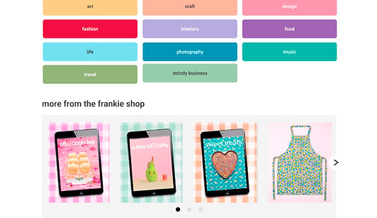
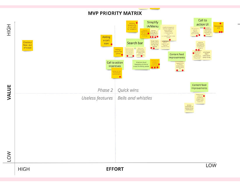
We identified inconsistencies in the branding across the website, particularly in the online shop, which appeared markedly different from the homepage. Users reported challenges in navigating the site due to visual clutter, disorganized content, and confusion regarding the navigation bar. Additional issues that required attention included font readability, visibility of calls to action, and content classification. A minimum viable product (MVP) was developed to identify the "low-hanging fruits" that could be prototyped for maximum impact.
03. BRAINSTORMING
Wireframing
Following the development of the MVP, I initiated the wireframing process. I designed layouts and constructed an information architecture chart to enhance the navigational bar using MIRO. Subsequently, we developed high-fidelity prototypes in Figma. My responsibilities encompassed creating interactions and verifying the functionality of interactive buttons, a navigational bar, and a selectable horizontal carousel of items.


04. HIGH FIDELITY
Final Design & Final thoughts
Do not overlook the significance of brand style guides and organization. Ensuring that the online shop and homepage reflect the Frankie brand consistently, along with categorizing topics by color, resulted in user testing where 8 out of 9 participants expressed a desire to use the website more often and found it easy to navigate.